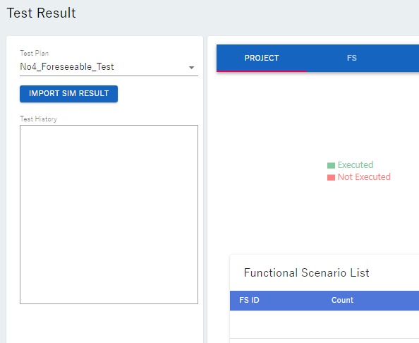
In the json file described in ⑤ Execute simulation of evaluation scenarios, if there are multiple evaluation scenarios, the collision avoidance (PASS)/collision (FAIL) ratio can be visualized in a pie chart. In addition, if the evaluation specifications that define the evaluation scenarios are created based on the "avoidable" range, the simulation results can be displayed superimposed on a diagram of the "avoidable" range/"unavoidable" range. This chapter explains the procedure for doing so.
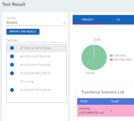
Example 1: Visualize simulation results of the evaluation specification "No4_Foreseeable"
Left-click on the sixth icon ※ from the top on the left side of the screen.
Left-click the "TestPlan" selection button and select "No4_Foreseeable_Test". The following screen will appear.
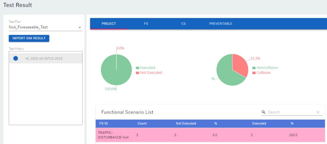
Click the "IMPORT SIM RESULT" button and specify the json file created in ⑤ Execute simulation of evaluation scenarios(43e11c28_sim_result.json in this tutorial example). The following screen will appear.
Two pie charts are displayed. The pie chart on the left shows the percentage of simulations that were successfully executed. In this case, the results of all three were recorded in the json file, meaning that all of them were successfully executed.
The pie chart on the right shows the collision/collision avoidance ratio for the evaluated scenarios. As mentioned in ⑤ Execute simulation of evaluation scenarios, only scenario 1 was determined to be a collision (FAIL) this time, so the corresponding information is displayed.
If there is a collision (FAIL) in the evaluation results, the Functional Scenario List will be displayed in light pink.
Example 2: Visualize simulation results for evaluation specification "No4_Preventable"
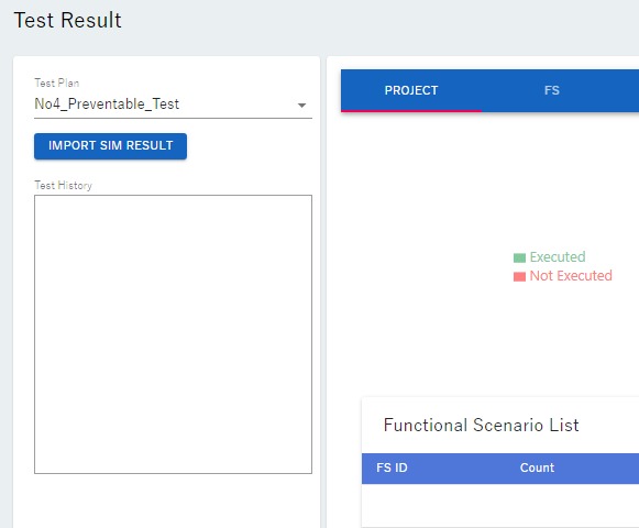
Left-click the "TestPlan" selection button and select "No4_Preventable_Test". The following screen will appear.
Click the "IMPORT SIM RESULT" button and specify the json file created in ⑤ Execute simulation of evaluation scenarios (7a1532f9_sim_result.json in this tutorial example). The following screen will appear.
Two pie charts are displayed. The pie chart on the left shows the percentage of simulations that were successfully executed. In this case, the results of all 16 cases were recorded in the json file, meaning that all of them were successfully executed.
The pie chart on the right shows the collision/collision avoidance rate for the evaluated scenarios. As mentioned in ⑤ Execute simulation of evaluation scenarios, scenarios with odd-numbered evaluation scenario numbers were determined to be collisions (FAIL), and the corresponding content (50[%] was collision) is displayed.
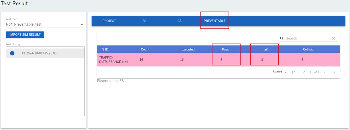
Left-click the "PREVENTABLE" button displayed on the screen. The following screen will be displayed.
"Pass" and "Fail" on the screen indicate collision avoidance/collision.
As shown in ⑤ Execute simulation of evaluation scenarios, in this manual, the simulation results (collision avoidance/collision) of the 16 evaluation scenarios are set to match avoidable/unavoidable, and the corresponding results (8 "Pass" and 8 "Fail") are displayed.
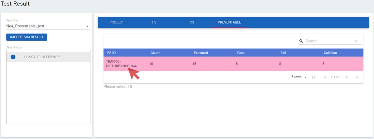
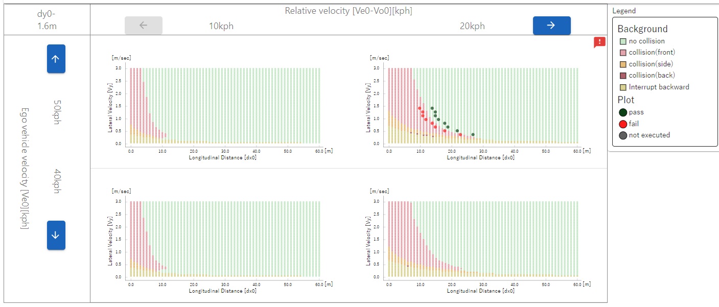
Left-click on the "TRAFFIC-DISTURBANCE-No4" button shown below.
The screen shown below will be displayed.
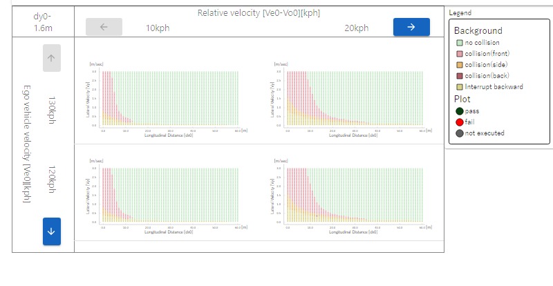
The "preventable" range of scenario "No. 4" is expressed as a two-dimensional range with \(d_{x0}\)(Initial longitudinal distance) on the horizontal axis and \(V_{y}\)(Maximum lateral velocity) on the vertical axis. The green area is the "preventable" area.
This range is influenced by \(V_{e0}\) (Vehicle under test initial longitudinal velocity)and \(V_{e0}-V_{o0}\) (Initial longitudinal relative velocity).Therefore, we define \(V_{e0}\) and \(V_{e0}-V_{o0}\) multiple times at regular intervals, create a graph showing the "preventable" range for each, and display it on the screen.
The graph shows green, pink, red, orange, and yellow ranges. Their meanings are as follows:
color
meaning
green
non-collision = "preventable" range
pink
Front collision of the ego vehicle
orange
Side collision of the ego vehicle
red
Rear collision of the ego vehicle
yellow
The other vehicle going around behind the ego vehicle (reference data)
Left-click the down arrow button and right arrow button on the screen to display a graph where \(V_{e0}\) is 50 [km/h] and \(V_{e0}\) -\(V_{o0}\) is 20 [km/h], according to the evaluation specifications ※.
※ The up and left arrow buttons also become available during operation. Use these four buttons to adjust the view.
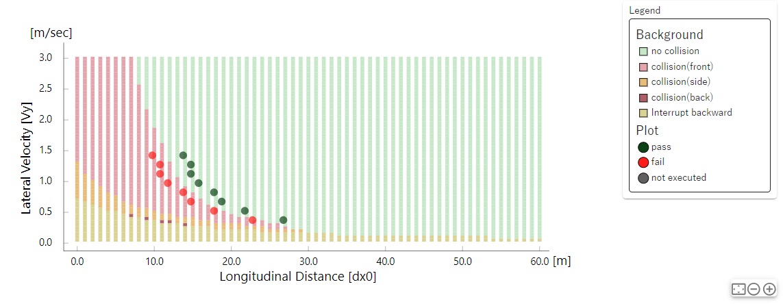
The adjusted results are shown below.
An enlarged portion of the above screen is shown below.
There are three types of plots displayed on the screen: green plots indicate collision avoidance (pass), red plots indicate collisions (fail), and grey plots indicate the simulation was not executed (not executed).
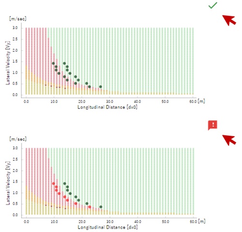
The mark in the upper right corner of the graph will display a green check mark if all evaluation results are collision avoidance (PASS), but a red exclamation mark will be displayed if there is even one collision (FAIL).
As shown in ⑤ Execute simulation of evaluation scenarios, in this manual, the simulation results (collision avoidance/collision) of the 16 evaluation scenarios are set to match avoidable/unavoidable, and the corresponding content is displayed.